Chroma
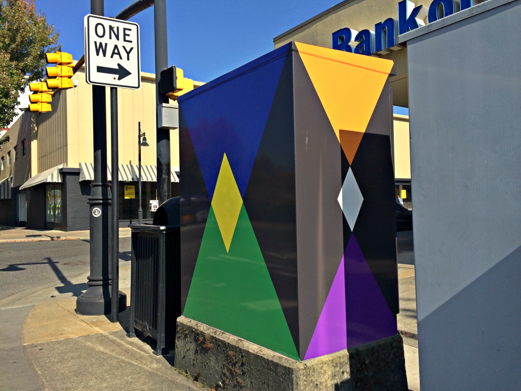
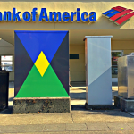
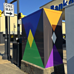
Jason’s artwork is a result of the City of Renton’s desire to improve the aesthetics of Downtown Renton by utilizing a new “wrapping” process for public utility boxes. After completing his design, Jason’s artwork was produced as a film applied to a city utility box that controls the adjacent traffic signal at S. 3rd Street and Burnett Avenue South.
The project is funded by the Renton Community Marketing Campaign. In 1997, the City of Renton, in conjunction with the Renton Chamber of Commerce, Renton Technical College, Valley Medical Center, Renton School District and the Renton Visitor’s Connection, launched the campaign. Its mission is to collectively market the Renton community to recruit quality companies and diversify Renton’s employment base. For this project, the campaign members are helping to improve the downtown area as a destination for the arts.
Jason will graduate from Renton High School in June 2015. His artwork was selected from 13 designs submitted by students in the Renton High School Video Production and Visual Communications program during the 2014-2015 school year. Jason’s design was selected for both its array of colors, ability to capture attention by both drivers and pedestrians, and its overall simplicity.
As part of developing his design, Jason provided the following statement as to his inspiration:
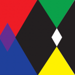
“I designed my wrap like this because I wanted to make it colorful in order to represent the diverse community that I am enveloped by at Renton High School. The basic colors Red, Blue, and Green: these represent a few of the multitude of races that I am surrounded by.
The diamonds represent the fact that every race is a treasure, no matter what their appearance is. The miniature diamonds that are produced where the others intersect represent mixed races. The Red + Blue diamonds fuse to create a purple diamond, and the Blue + Green diamonds fuse to create a yellow diamond. The black diamonds represent what happens when a myriad of different races unite; a melting pot of races is forged. It doesn’t represent only one race; it represents all of the races together as one.
An influence for my design would be from one of my fellow classmates working on the wrap project simultaneously; his name is Oswaldo Lopez. His wrap consisted of a series of colorful squares and rectangles that enveloped the entirety of the wrap. I thought that it looked very interesting and decided to incorporate the idea into my own wrap because I thought that adding multiple colors would be vibrant and eye-catching to the public eye.
Coincidentally, after meeting with the committee members that selected my wrap for this project, the colors I decided to use in my wrap turned out to represent the three high schools in the Renton School District: Renton High School (red, white, black), Hazen High School (blue, yellow), and Lindbergh High School (blue, white). This was pure coincidence, but it offers another interpretation of the design: the three high schools becoming united in Downtown Renton.”
Please learn more about the Renton School District at www.rentonschools.us.
The utility box wrap material is a beautification and anti-graffiti product that was produced and installed as a collaboration between VSP Marketing Graphic Group (www.vspgraphicgroup.com) and Trafficwrapz.com (www.trafficwrapz.com).